Takeaways from Jean-luc Doumont Workshops
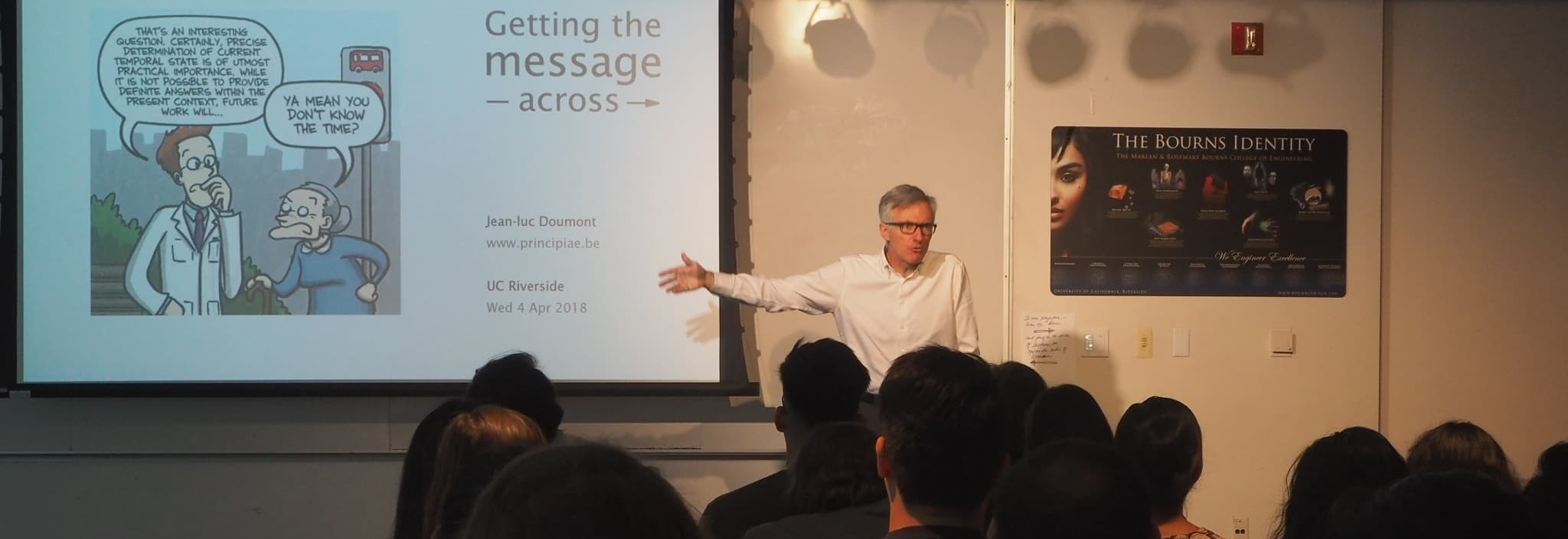
“Scientists cannot communicate very well with non-scientists, but in fact they cannot communicate well with other scientists either.”
“When people like you talk about their research, half of the time even your peers don’t understand what the hell you are talking about, and when they do understand they find it boring. That’s the sad truth.”
“People can only learn something new if they can relate it to something they already know. That’s the only way.”
— Jean-luc Doumont
Category: Takeaway
Tags: Jean-luc Doumont, Edward Tufte
A Note about Categories
I often want to share thoughts after consuming content from an engaging author but I’m not sure what to call it. Review isn’t right; narcissism not withstanding, I don’t consider myself in a position to judge the works of someone as esteemed as Jean-luc Doumont. Takeaway is more promising, it can be any of the following:
A Note about Tags
Tufte is tagged because in many ways Doumont is the second generation of these ideas; Tufte is the originator.
Jean-luc Doumont1 is a self-proclaimed “articulate, entertaining, and thought-provoking presenter,” as well as a “popular instructor and invited speaker worldwide.” I heard him speak when I was working as a postdoc at KU, and he, along with Merlin Mann,2 became one of the major influences on how I think about communication. Much like Merlin, I think Doumont primarily makes a living by traveling and giving speeches; GSK recently invited him to give a training on graphing and on written documents. Overall I was very impressed with Doumont as a speaker and grateful that GSK facilitated this opportunity, especially given that the lion’s share of Doumont’s advice runs counter to GSK’s corporate culture — Doumont advocates minimalism, achieved by putting aside the company templates, to let the readers focus on the content without the distracting noise caused by what Edward Tufte3 has previously called “administrative debris.”
Conveying Messages With Graphs
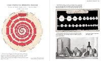
I thought that the graphing session was a very engaging and concise summary of Edward Tufte’s first book, The Visual Display of Quantitative Information.4 For those attending Ryan’s (a coworker at GSK - CMC Stats) tutorial series on JMP, they may recall that Tufte is the statistician Ryan mentioned in his first talk, who forwarded this image depicting Napoleon’s march across Europe as “probably the best statistical graphic ever drawn.”
Napoleon’s March Across Europe
— Charles Minard
Doumont vs. Tufte
My regard was lessened somewhat when in speaking to Doumont after the session I asked him directly about Tufte and could not get him to admit to Tufte being a source of inspiration. After the session I discovered that the two have somewhat of a history; I initially thought that this may be why Doumont is reluctant to mention Tufte. Tufte wrote in Wired Magazine that “PowerPoint is Evil,
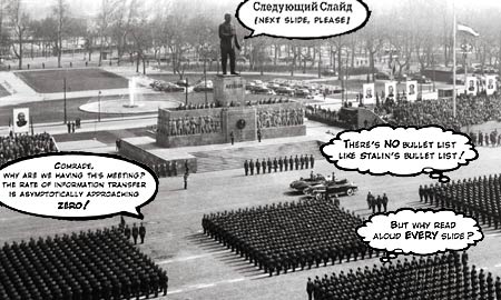
— Edward Tufte
and has also laid the blame for the Challenger Space Shuttle explosion on decision making errors caused by PowerPoint being an insufficient medium for the presentation of technical information.
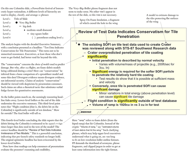
PowerPoint Does Rocket Science
— Edward Tufte
Doumont subsequently published a rebuttal in Technical Communication titled “Slides are not Evil,” where he argues that while he agrees that a lot of slides are bad, this can be mitigated through more conscientious slide designs.
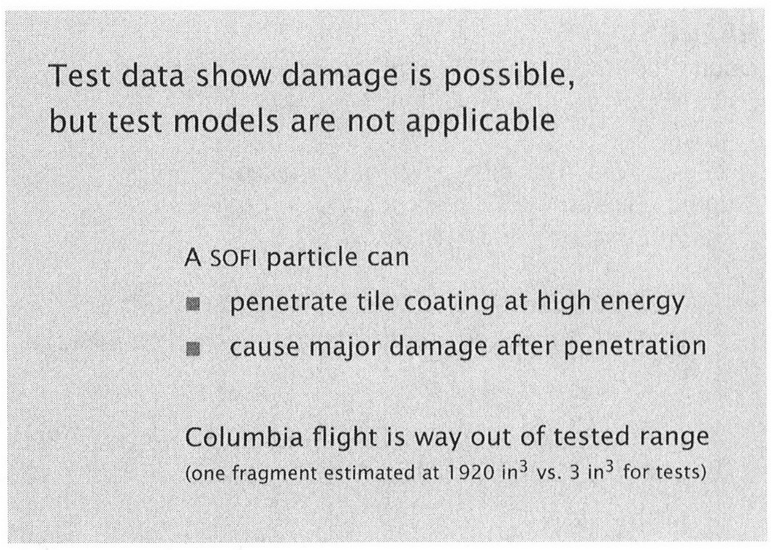
— Jean-luc Doumont
However, in thinking about this more, it’s probably just a legal thing; If Doumont is giving speeches and writing books based, at least in part, on Tufte’s ideas, and admits it openly, Tufte is probably entitled to a cut of it. If this is the case, I don’t really blame Doumont for not talking about his influences in a professional context.
Doumont vs. Excel
Doumont was reluctant to talk about specific tools in both sessions. However, when pressed during the graphing session by someone asking how he made the graphs he was showing, he mentioned that you can’t really make them in tools like Excel. He thinks that there are really only two options:
- If you’re interested in learning how to program,
- If you’re not interested in programming,
- making graphs close to what you want and importing the result into InkScape7 for modification manually is best.
I was surprised that Doumont could not find anything redeeming to say about Excel given his previous defenses of PowerPoint and Word. Tufte similarly admonishes the use of Word; he is an advocate of the document typesetting system LaTeX, a sort of programming language where the source code compiles into documents as opposed to programs.8 Here Tufte is again criticizing NASA, this time on twitter for not designing their technical reports in LaTeX, saying that “real scientists and engineers do.”

Doumont’s position that truly effective graphs can really only be designed in R or Python seems very similar to Tufte’s position that technical reports can only be designed in LaTeX. I think a lot of Doumont’s advice is easily implemented in Excel. For example, the style that Doumont considered most effective for bar charts is simple to build using the “data bar” feature in the conditional formatting menu.

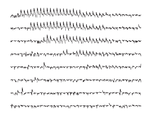
In another example, Doumont reduced the dimensionality of a data set through the use of multiple graphs in a grid sharing axes; the technical term for such a display is a “small multiple.” In one slide Doumont took this to the extreme and removed all axes and displayed many very small charts, which struck Harley9 as being very similar to the “sparkline” feature in Excel.

Using Sparklines to Visualize Pokémon Stats
It seems like an odd omission, but possibly relevant is that Tufte is widely credited with the invention of both sparklines10 and the small multiple.11
Doumont Advocates Programming Languages as Most Effective Graphing Tools
While I think Excel is an adequate tool, I certainly do agree with Doumont. For those given to abstract thinking who are often frustrated with the limitations of Excel, moving to an environment such as R is the best solution. While switching to a better designed and more fully featured graphing program such as OriginLab might seem tempting, I think this will only delay the problem as it is more likely than not you’ll run into a new set of constraints later on down the line. Furthermore, plotting in R (commonly performed using the ggplot212 package) is a more natural environment to operate under the Doumont/Tufte paradigm of minimalism. With What-You-See-Is-What-You-Get (WYSIWYG) graphing tools such as Excel, most users would insert a noisy stock chart and modify from there, removing unnecessary elements one-by-one. Conversely, charts in ggplot2 are built layer-by-layer, starting from a blank page. For example, my first foray into R was to help our group members more easily get data out of PDF reports produced by our LC equipment.
Assume we start with the following data:
| Area | Amount | Concentration |
|---|---|---|
| 134135 | 1.0 | 0.1 |
| 201152 | 1.5 | 0.1 |
| 268158 | 2.0 | 0.1 |
| 335916 | 2.5 | 0.1 |
| 391649 | 3.0 | 0.1 |
This is the line of code we start with to plot the data:
> plot <- ggplot(data, aes(Amount,Area))
> plot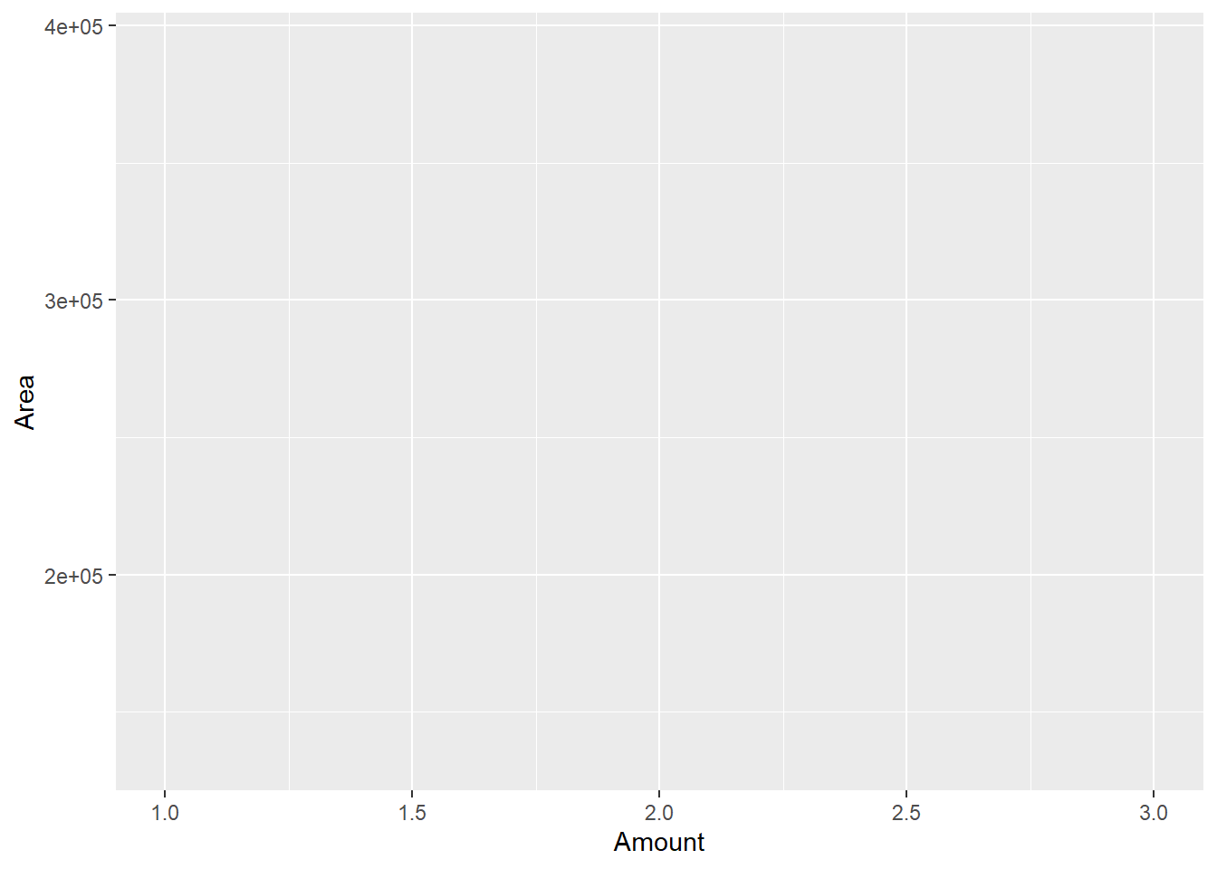
By default ggplot2 does not’t even plot any of the data! The data need to explicitly mapped to specific geometries, e.g. points, lines, bars. This command maps the standard curve data to the point geometry:
> plot <- plot + geom_point()
> plot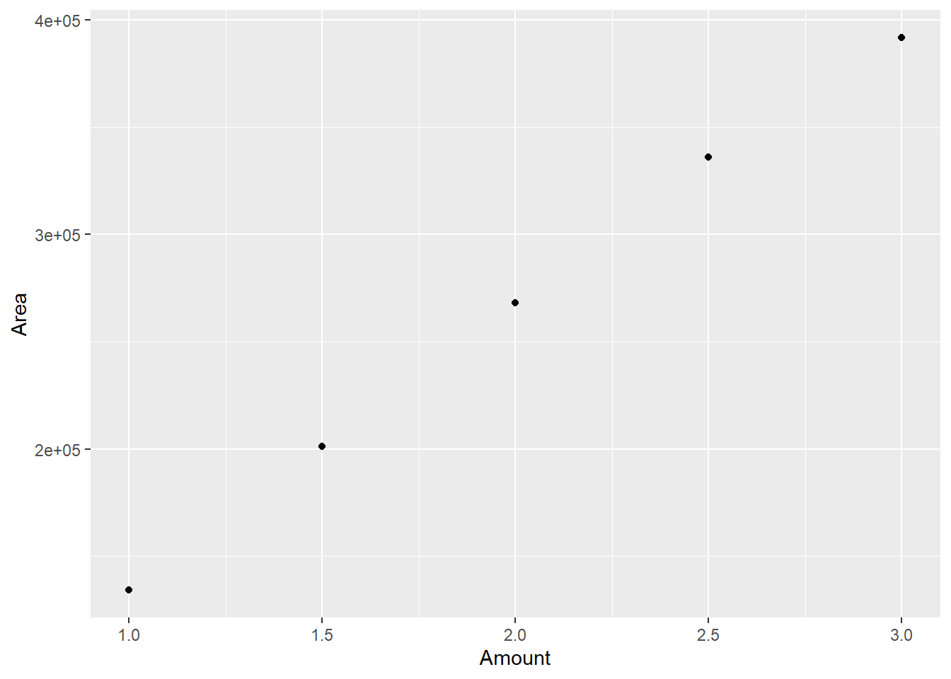
However, the plot is not very Tufte-esque, this command removes some of the noise (kindly ignore the inherent contradiction of requiring an extra command to remove complexity while I’m trying to persuade you that ggplot2 is a more natural environment for Tufte’s minimalism):
> plot <- plot + theme_bw()
> plot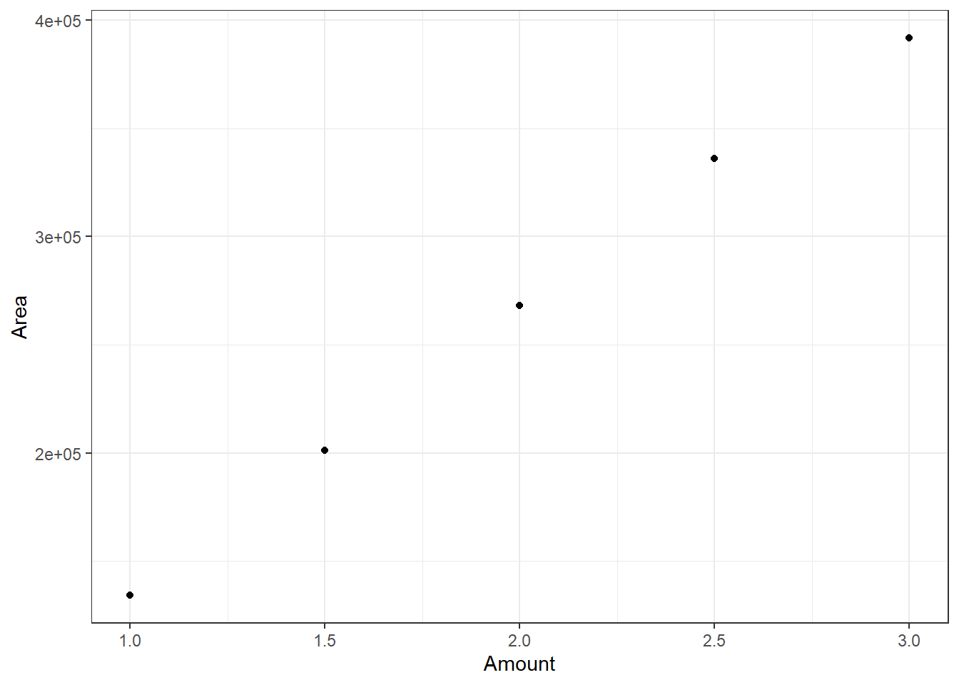
Finally, these commands construct a linear regression model and map it to the line geometry:
linearMod <- lm(Area~Amount, data=data)
plot <- (
  plot + geom_abline(
    intercept = linearMod$coefficients[1],
    slope = linearMod$coefficients[2]
  )
)
plot
You can think of the linear fit to the data as adding another level of abstraction (the first was mapping the raw data to geometric shapes — the points), as it is the underlying pattern that governs the raw data that we have mapped to the line geometry. Abstracting further, really the message of such a display is to show how well the line fits the data, which we could sum up with one number, the R2 value.
So you can see already with this simple example that ggplot2 in the R environment enables multiple levels of abstraction of the data and enables the visualization of those abstractions by adding elements one-by-one to the plot, meaning one is much more likely to have a less busy plot. Once you know what is effective for a given graph type, it can be packaged into a function:
PlotData <- function() {
  linearMod <- lm(Area~Amount, data=data)
  plot <- (
    ggplot(data, aes(Amount,Area))
      + geom_point()
      + theme_bw()
      + geom_abline(
        intercept = linearMod$coefficients[1],
        slope = linearMod$coefficients[2]
        )
  )
  return(plot)
}
So that everything above can be done with a single line!
> PlotData()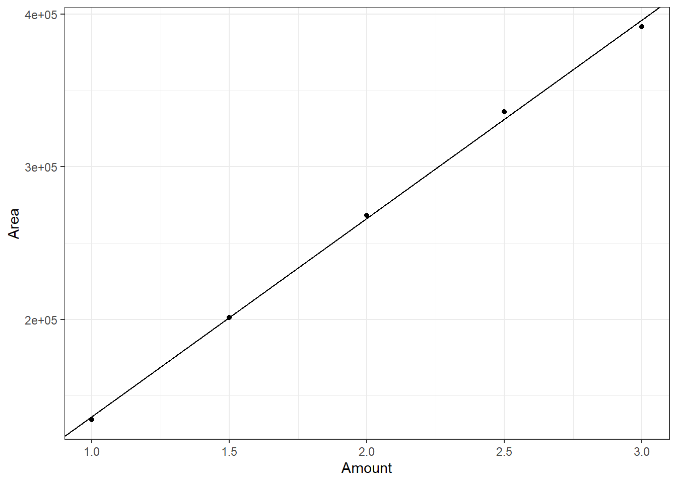
Doumont vs. Smoothed Lines
Doumont asked for submission of reports written by the attendees well before the workshop; he was quite critical of the graph from a group member (I don’t quite recall whom), slightly edited here from the report to maintain confidentiality.

— Unspecified GSK Employee
He said that the smoothed lines are a misrepresentation of the data and that he recommends straight, point-to-point lines. Employing some of the other things I learned in the session, I think he would prefer something like this.
However, even in this case, are we still not implying a relationship between the points that doesn’t exist? For example, between the first points (1,40) and (2,38), do we really know that it’s a linear decrease? There are other possibilities:
Whether you draw a straight or smooth line between points, you are still implying a relationship between the points that may not be true. I can imagine two counter arguments:
- A linear relationship is the simplest assumption
Is it though? How likely is it that the true function underlying the data has a non-differentiable point at (2,38)? How common are functions that are not fully differentiable in experimental biology?
- It’s more of a schematic representation, the value goes from Y1 to Y2 over interval \(\Delta\)X
If the connecting line is just a representation, does the shape matter?
To avoid misrepresenting the data, perhaps no lines:
Or some fit to the data, perhaps a logical fit using a smoothed conditional means:
> ggplot(data, aes(Component1,Component2))
>   + geom_point()
>   + theme_bw()
>   + geom_smooth(se = FALSE)
## `geom_smooth()` using method = 'loess' and formula 'y ~ x'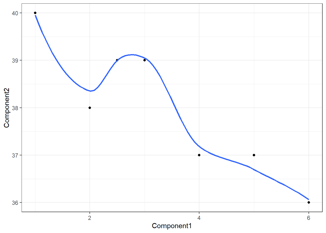
Structuring Written Documents
While the graphing session was mostly a rehash of Tufte’s ideas, Doumont had a lot to offer otherwise. To some extent during the writing session and to a much larger extent in his book, Trees, Maps, and Theorems,13 Doumont extends these ideas to written documents, slides, oral presentations, and even e-mail. With regard to written documents, he was similarly agnostic as to specific tools. However, my feeling is that if R encourages the user to think abstractly and logically about data, perhaps the logical extension of this idea is that LaTeX encourages the user to think the same way about prose. Following this argument, Microsoft Word is a WYSIWYG text editor in the same way that Excel is a WYSIWYG graphing tool; it encourages you to pay attention to content and formatting simultaneously. Has this ever happened to you?

A Common Occurrence in Microsoft Products
Contrast this with LaTeX, which encourages the separation of the development of the content from the presentation of the content. This relates to the so-called Separation of Concerns Principle14 and the Abstraction (or Don’t Repeat Yourself) Principle,15 where a modification of any single element of a system should not require a change in another logically unrelated element. Finally, I think that LaTeX encourages good information systems design, where *.tex files can point to a single source of truth16 in a database rather than replicate the data in every report that references said data.
“Let me try to explain to you, what to my taste is characteristic for all intelligent thinking. It is, that one is willing to study in depth an aspect of one’s subject matter in isolation for the sake of its own consistency, all the time knowing that one is occupying oneself only with one of the aspects. We know that a program must be correct and we can study it from that viewpoint only; we also know that it should be efficient and we can study its efficiency on another day, so to speak. In another mood we may ask ourselves whether, and if so: why, the program is desirable. But nothing is gained —on the contrary!— by tackling these various aspects simultaneously. It is what I sometimes have called”the separation of concerns“, which, even if not perfectly possible, is yet the only available technique for effective ordering of one’s thoughts, that I know of. This is what I mean by”focusing one’s attention upon some aspect“: it does not mean ignoring the other aspects, it is just doing justice to the fact that from this aspect’s point of view, the other is irrelevant. It is being one- and multiple-track minded simultaneously.”
— Edsger Dijkstra, “On the role of scientific thought”
Jean-luc Doumont - Structuring Your Thoughts
 ↩
↩Merlin Mann’s website about finding the time and attention to do your best creative work.
 ↩
↩Edward Tufte is known as “The da Vinci of data” and “The Galileo of graphics.”
 ↩
↩R is an integrated suite of software facilities for data manipulation, calculation and graphical display.
 ↩
↩Python is an interpreted, object-oriented, high-level programming language with dynamic semantics.
 ↩
↩Inkscape is professional quality vector graphics software.
 ↩
↩LaTeX is a high-quality typesetting system; it includes features designed for the production of technical and scientific documentation.
 ↩
↩Harley Quinn - Neurodivergent Scientist, Artist, Edge thinker, Perfectionist, Pineapple enthusiast.↩
Sparklines are small, intense, word-sized graphics with typographic resolution.
 ↩
↩Envisioning Information - This book celebrates escapes from the flatlands of both paper and computer screen, showing superb displays of high-dimensional complex data.
 ↩
↩ggplot2 is a system for declaratively creating graphics, based on The Grammar of Graphics.
 ↩
↩“On the role of scientific thought” — Edsger Dijkstra↩
“Every piece of knowledge must have a single, unambiguous, authoritative representation within a system”
Abstraction Principle Idea Discussed in “The Pragmatic Programmer”↩“SSOT systems provide data that are authentic, relevant, and referable” Discussed Here by IBM↩


